Screenshots Gallery
For pixeltao's NES Palette (version 2)
|
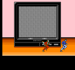
Click here to return to the main page. These screenshots were generated by NEStopia; if you see any oddities at the top and/or bottom, that's because NEStopia's screenshots ignore overscan clip settings, thus showing the top and bottom 8 pixels that are normally hidden on an NTSC television (and in most emulators). This is the second version of pixeltao's NES palette, made a week later with a bit of extra care. :) From pixeltao's blog:
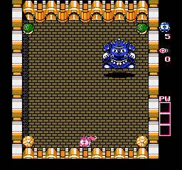
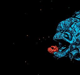
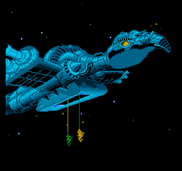
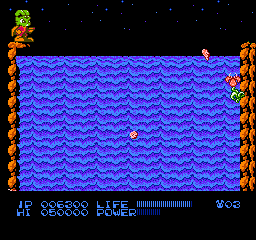
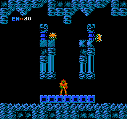
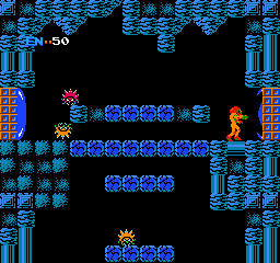
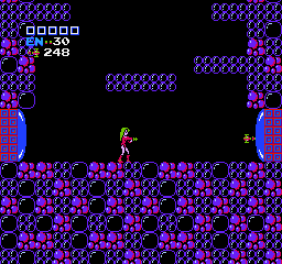
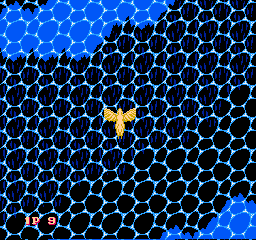
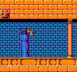
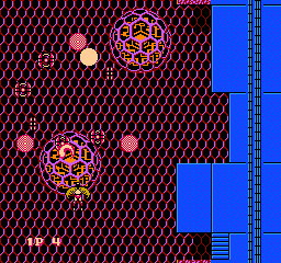
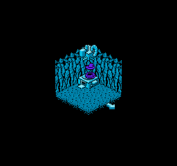
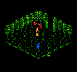
It looks better, but the blue parts of Metroid still look a little flat. :( |
||||||||||||||||||||||||||||||||||||||||||||||||||||||||||||||||||||
|
||||||||||||||||||||||||||||||||||||||||||||||||||||||||||||||||||||
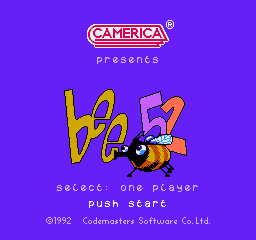
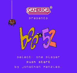
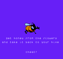
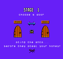
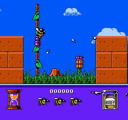
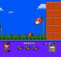
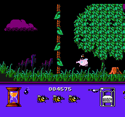
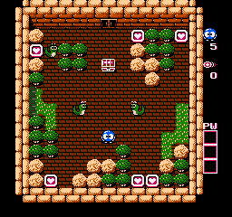
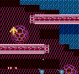
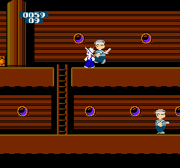
Bee 52
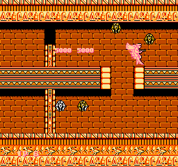
Interestingly, this palette has a brightened $1D black, so various background details show! :D
 |
 |
 |
 |
 |
 |
 |
 |
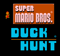
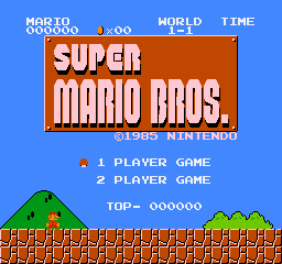
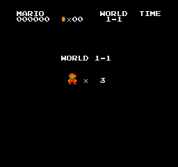
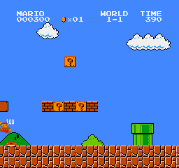
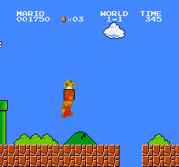
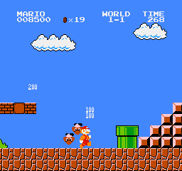
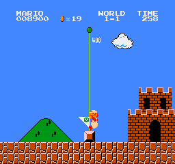
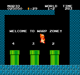
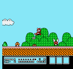
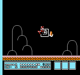
Super Mario Bros./Duck Hunt
 |
 |
 |
 |
 |
 |
 |
 |
 |
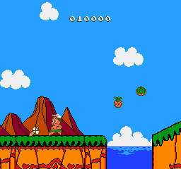
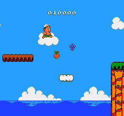
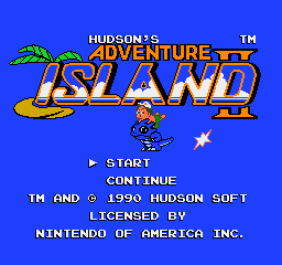
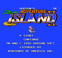
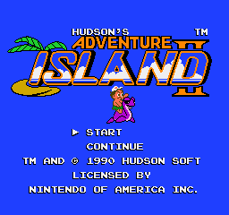
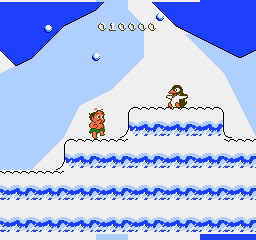
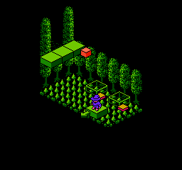
Adventure Island II
 |
 |
 |
 |
 |
 |
 |
 |
 |
 |
 |
 |
 |
 |
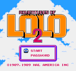
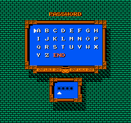
Adventures of Lolo 2
 |
 |
 |
 |
 |
 |
 |
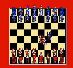
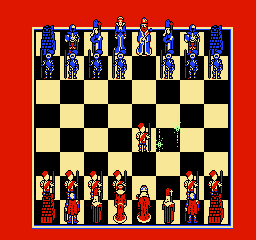
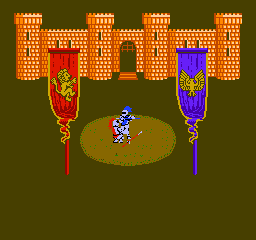
Battle Chess
 |
 |
 |
 |
 |
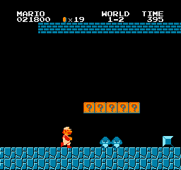
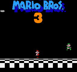
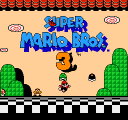
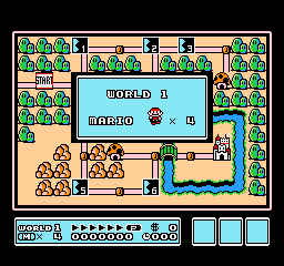
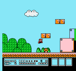
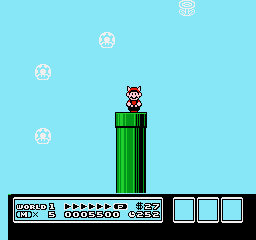
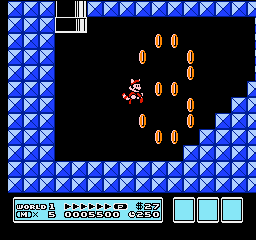
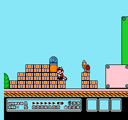
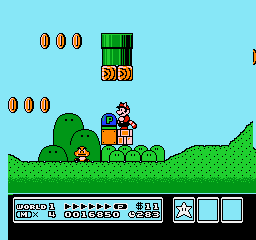
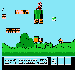
Super Mario Bros. 3
 |
 |
 |
 |
 |
 |
 |
 |
 |
 |
 |
 |
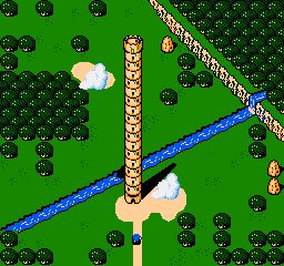
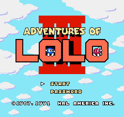
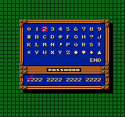
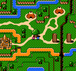
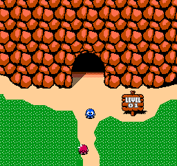
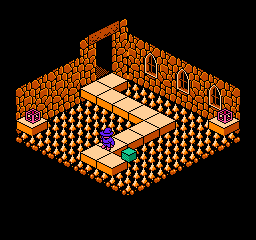
Adventures of Lolo 3
If the animation sticks, just wait a few seconds. It SHOULD restart. :)
 |
 |
 |
 |
 |
 |
 |
 |
 |
 |
 |
|
 |
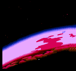
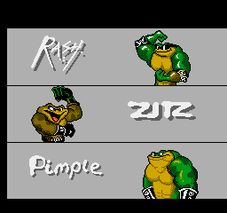
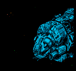
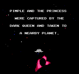
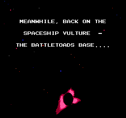
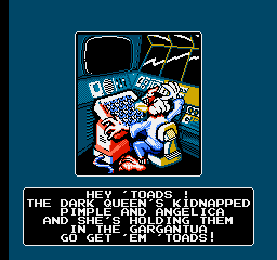
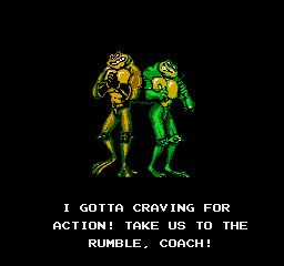
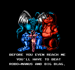
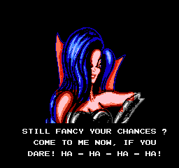
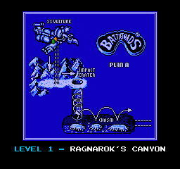
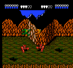
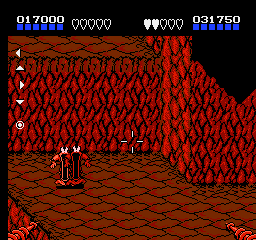
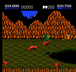
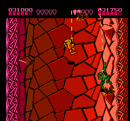
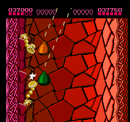
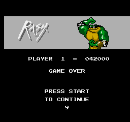
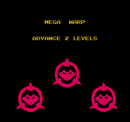
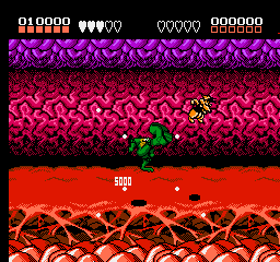
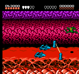
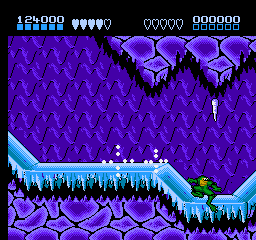
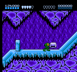
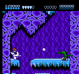
Battletoads
 |
 |
 |
 |
 |
 |
 |
 |
 |
 |
 |
 |
 |
 |
 |
 |
 |
 |
 |
 |
 |
 |
 |
 |
 |
 |
 |
 |
 |
 |
 |
 |
 |
 |
 |
 |
 |
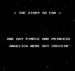
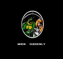
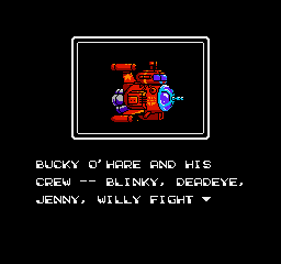
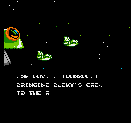
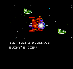
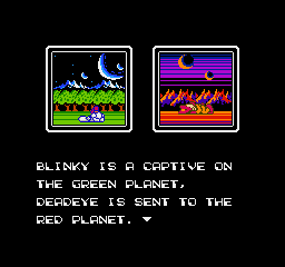
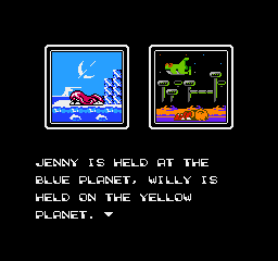
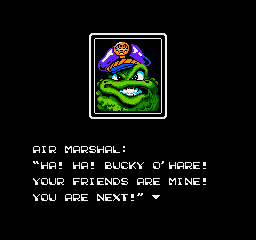
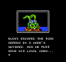
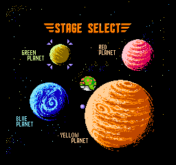
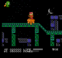
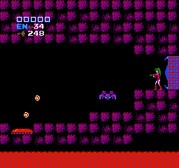
Bucky O'Hare
 |
 |
 |
 |
 |
 |
 |
 |
 |
 |
 |
 |
 |
 |
 |
 |
 |
 |
 |
 |
 |
 |
 |
 |
 |
 |
 |
 |
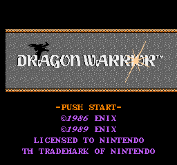
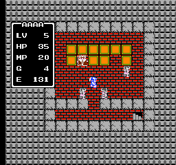
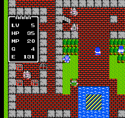
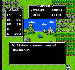
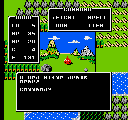
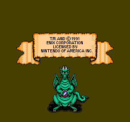
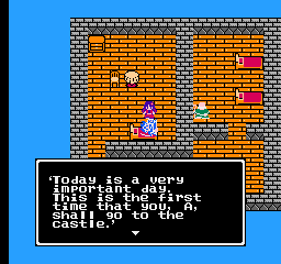
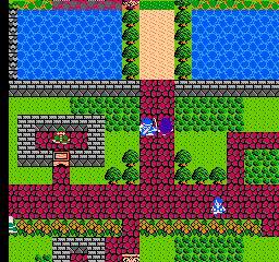
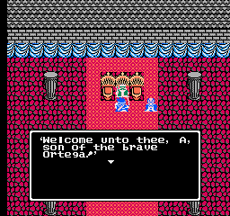
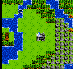
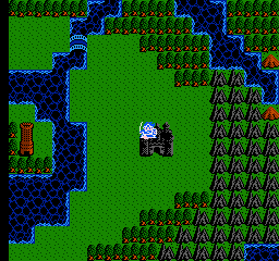
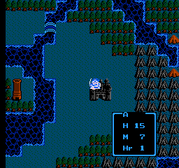
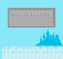
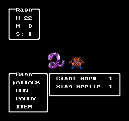
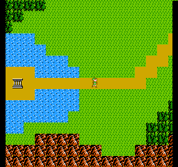
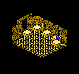
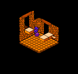
Dragon Warrior
 |
 |
 |
 |
 |
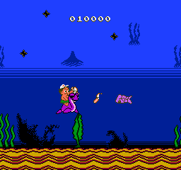
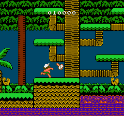
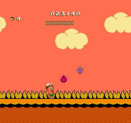
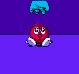
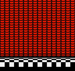
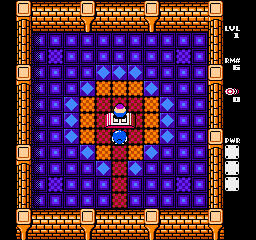
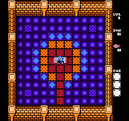
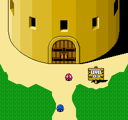
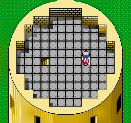
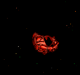
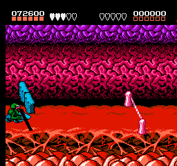
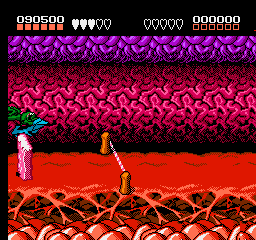
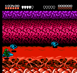
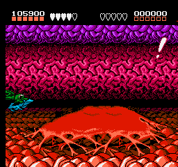
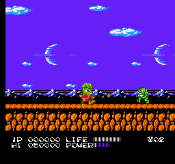
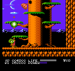
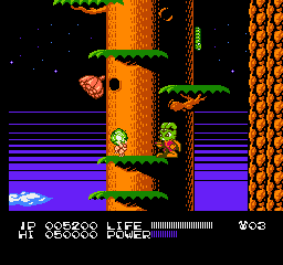
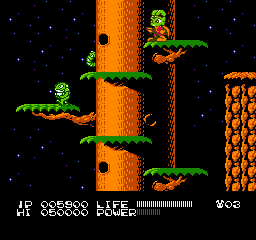
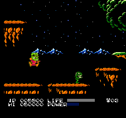
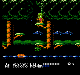
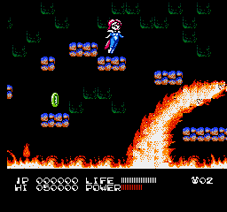
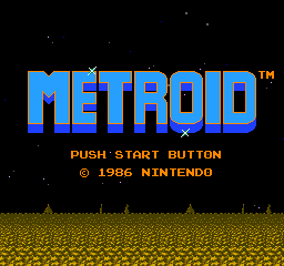
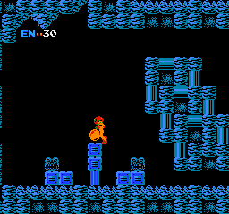
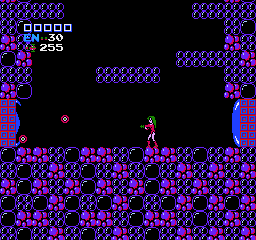
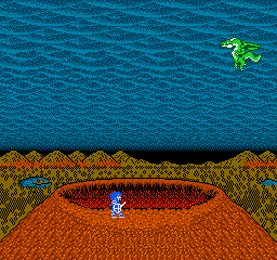
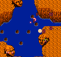
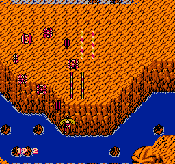
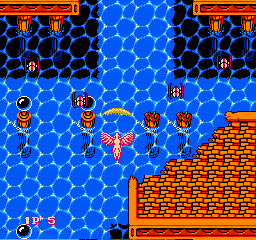
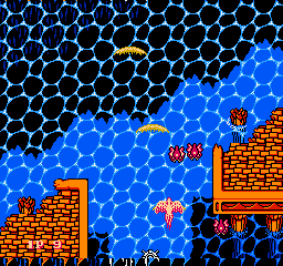
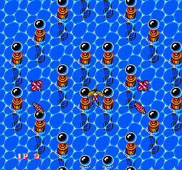
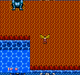
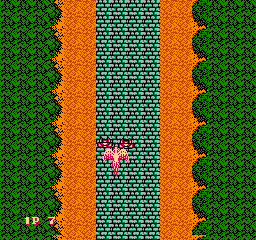
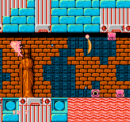
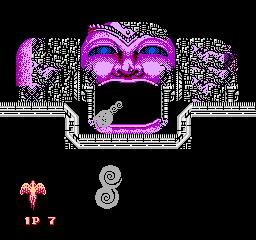
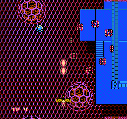
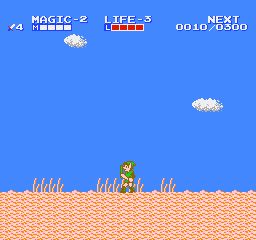
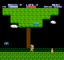
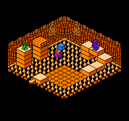
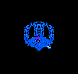
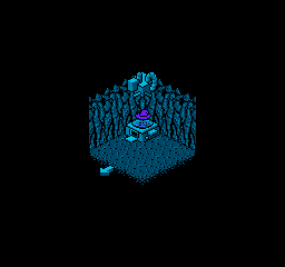
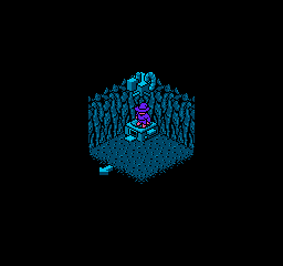
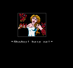
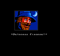
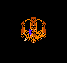
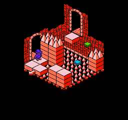
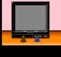
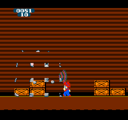
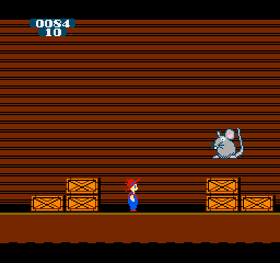
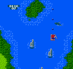
Metroid
If the animation sticks, just wait a few seconds. It SHOULD restart. :)
 |
 |
 |
 |
 |
 |
 |
 |
|
 |
 |
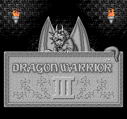
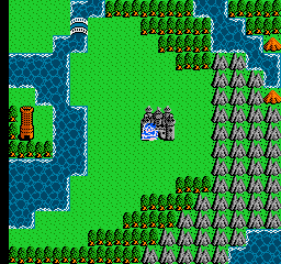
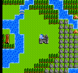
Dragon Warrior III
 |
 |
 |
 |
 |
 |
 |
 |
 |
 |
 |
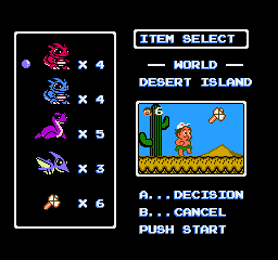
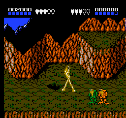
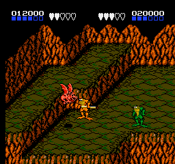
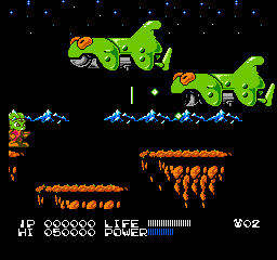
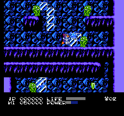
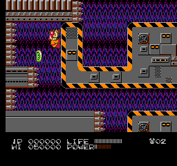
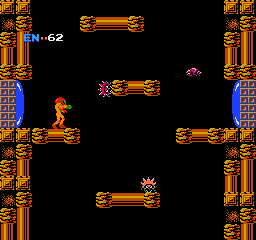
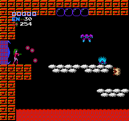
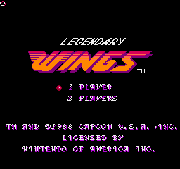
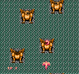
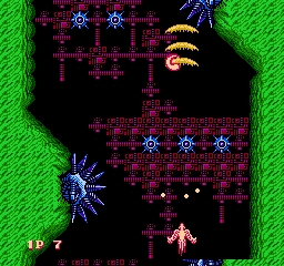
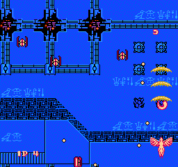
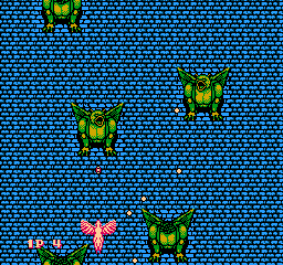
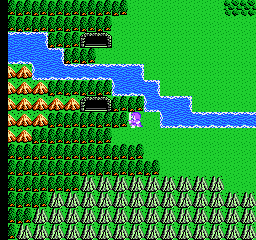
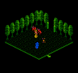
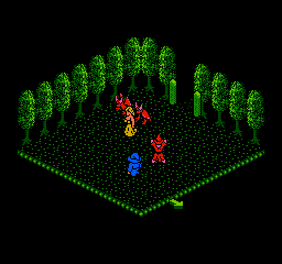
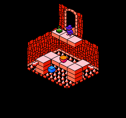
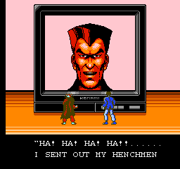
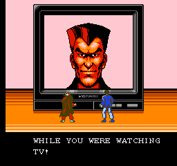
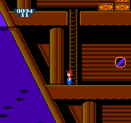
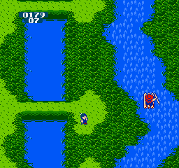
Legendary Wings
The last vertical-scrolling level uses $11 and $12 in a way that creates a really cool texture when playing the game on actual hardware and on a CRT TV. :D
 |
 |
 |
 |
 |
 |
 |
 |
 |
 |
 |
 |
 |
 |
 |
 |
 |
 |
 |
 |
 |
 |
 |
 |
 |
 |
 |
 |
 |
 |
 |
||
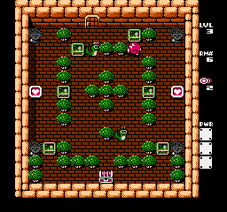
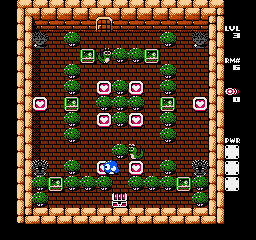
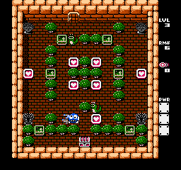
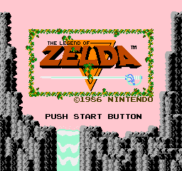
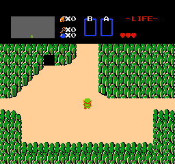
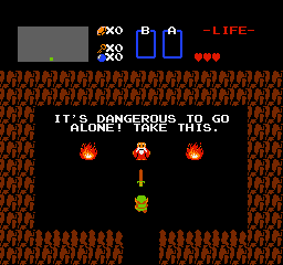
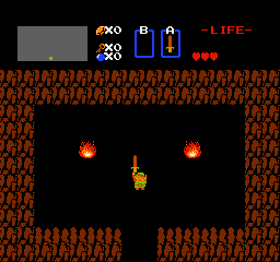
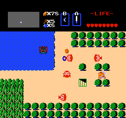
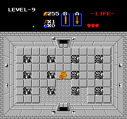
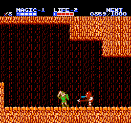
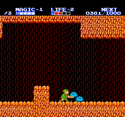
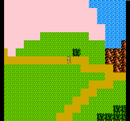
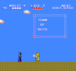
The Legend of Zelda
 |
 |
 |
 |
 |
 |
 |
 |
 |
 |
 |
 |
 |
 |
 |
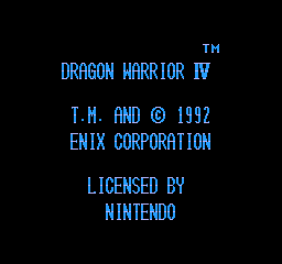
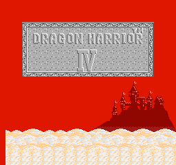
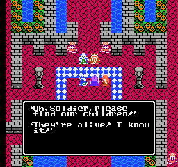
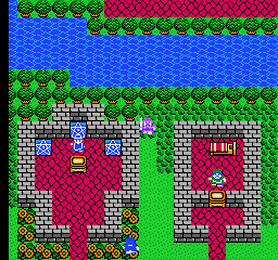
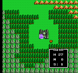
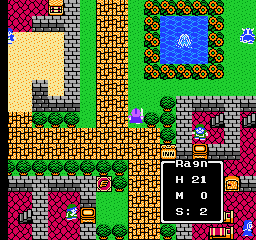
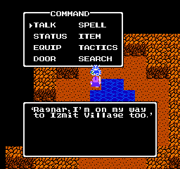
Dragon Warrior IV
 |
 |
 |
 |
 |
 |
 |
 |
 |
 |
 |
 |
 |
 |
 |
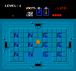
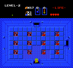
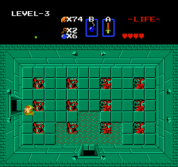
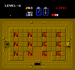
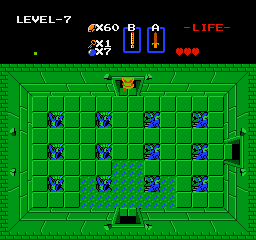
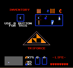
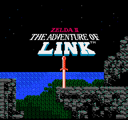
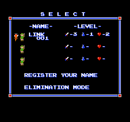
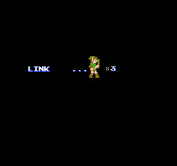
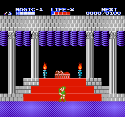
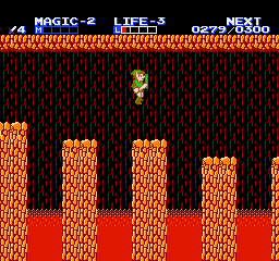
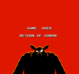
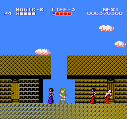
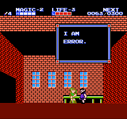
Zelda II: The Adventure of Link
 |
 |
 |
 |
 |
 |
 |
 |
 |
 |
 |
 |
 |
 |
 |
 |
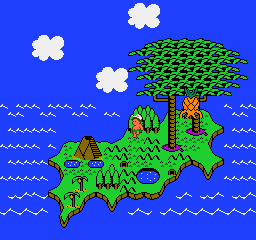
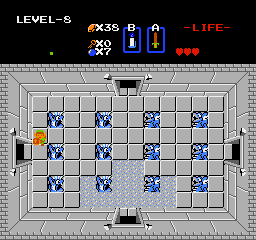
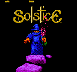
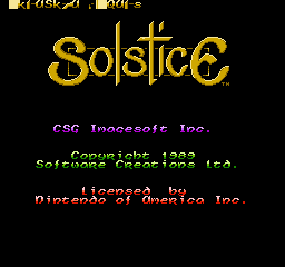
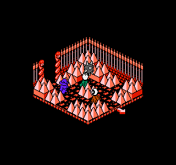
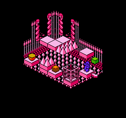
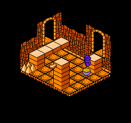
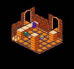
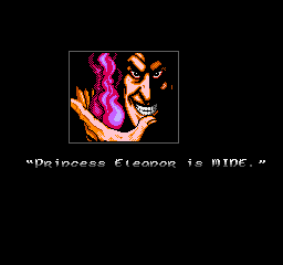
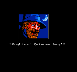
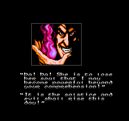
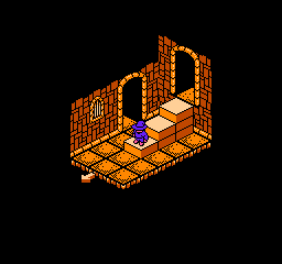
Solstice: Quest for
the Staff of Demnos
 |
 |
 |
 |
 |
 |
 |
 |
 |
 |
 |
 |
 |
 |
 |
 |
 |
 |
 |
 |
 |
 |
 |
 |
 |
 |
 |
 |
 |
 |
 |
 |
 |
 |
 |
 |
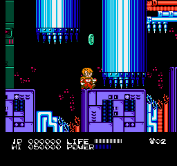
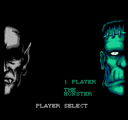
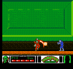
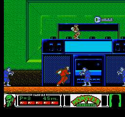
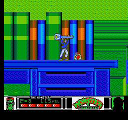
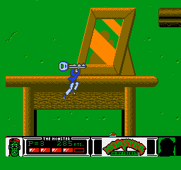
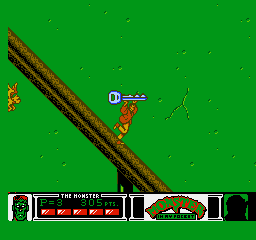
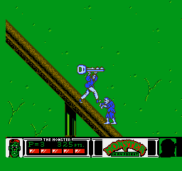
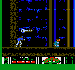
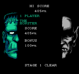
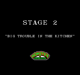
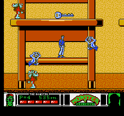
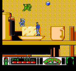
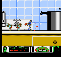
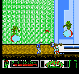
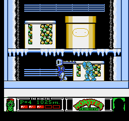
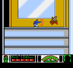
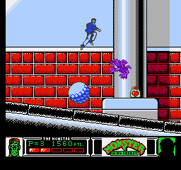
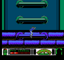
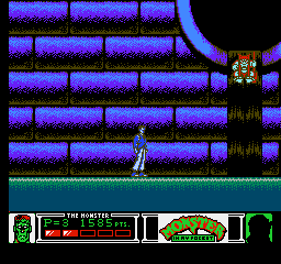
Monster in My Pocket
 |
 |
 |
 |
 |
 |
 |
 |
 |
 |
 |
 |
 |
 |
 |
 |
 |
 |
 |
 |
 |
 |
 |
 |
 |
 |
 |
 |
 |
 |
 |
 |
 |
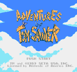
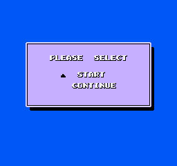
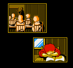
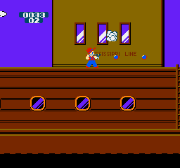
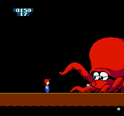
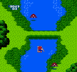
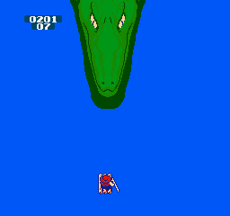
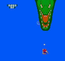
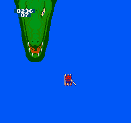
Adventures of Tom Sawyer
The alligator boss at the end of the rafting level uses two greens ($19 and $1A) that, on my actual NES Control Deck, are
almost indistinguishable — but they do add a cool texture due to the composite artefacting! :D
 |
 |
 |
 |
 |
 |
 |
 |
 |
 |
 |
 |
 |
 |
 |
 |
 |
 |
 |
 |
 |
All games whose images are upon this page belong to their respective creators. I'm simply using images from the games to demonstrate the palettes that I and others have made.