|
Click here to return to the main page.
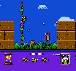
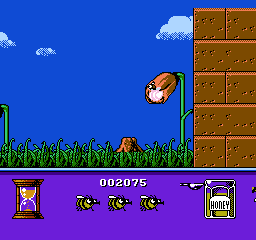
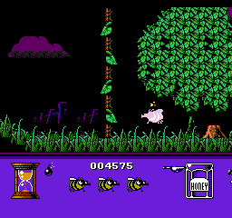
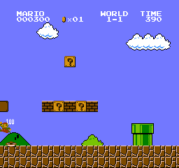
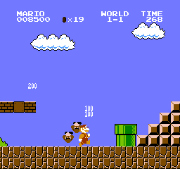
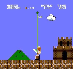
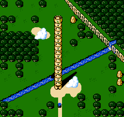
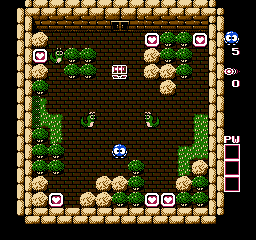
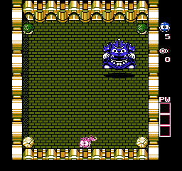
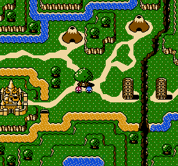
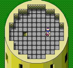
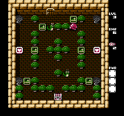
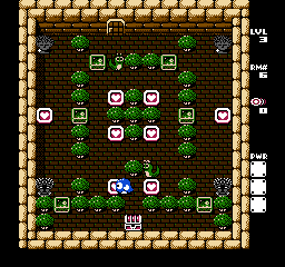
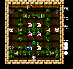
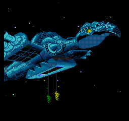
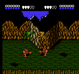
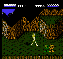
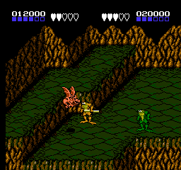
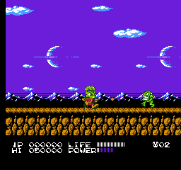
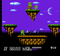
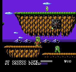
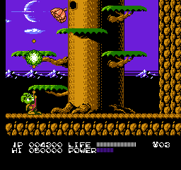
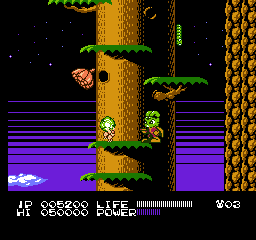
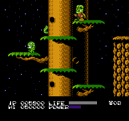
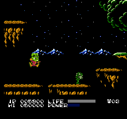
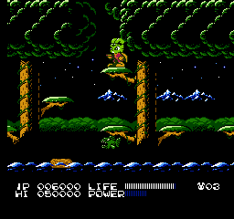
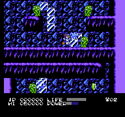
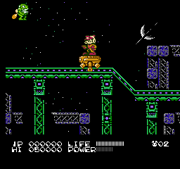
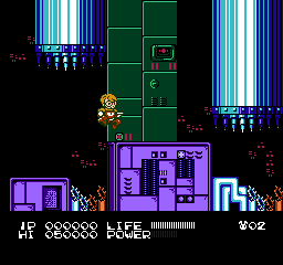
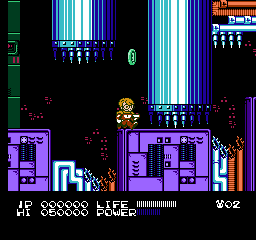
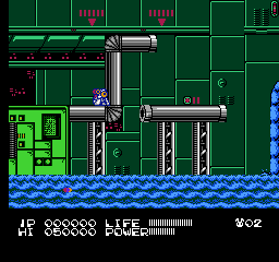
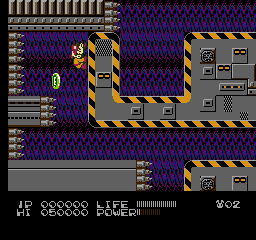
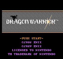
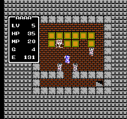
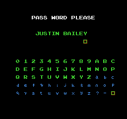
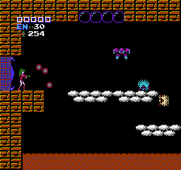
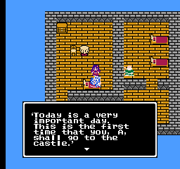
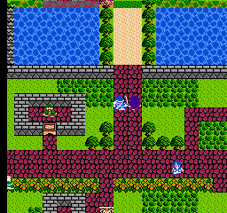
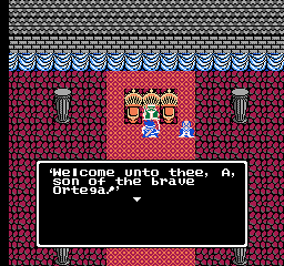
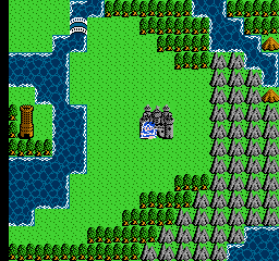
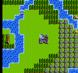
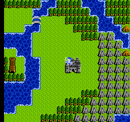
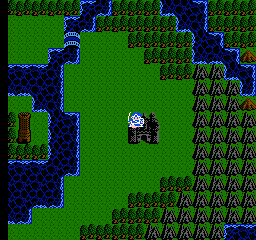
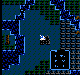
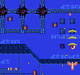
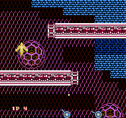
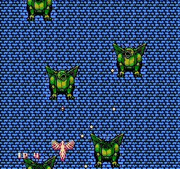
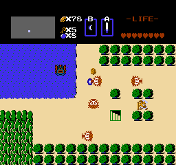
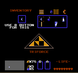
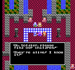
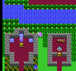
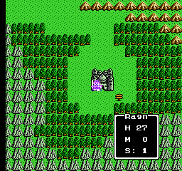
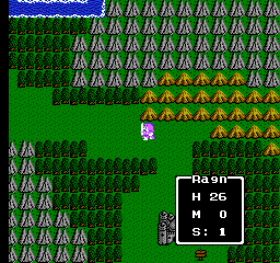
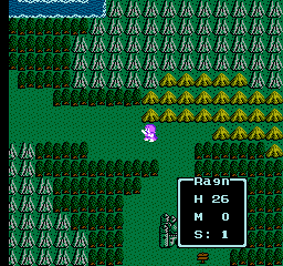
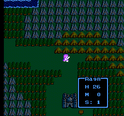
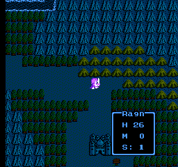
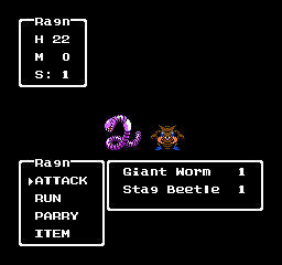
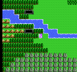
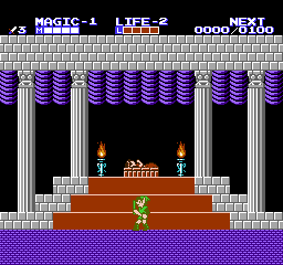
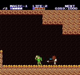
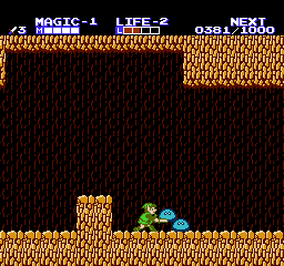
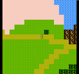
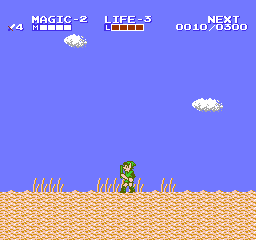
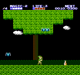
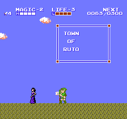
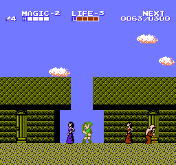
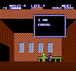
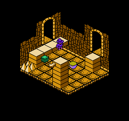
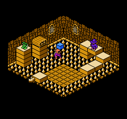
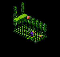
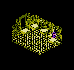
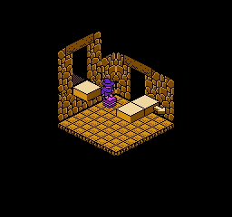
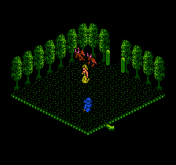
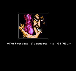
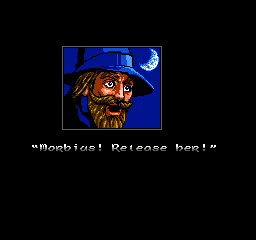
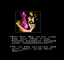
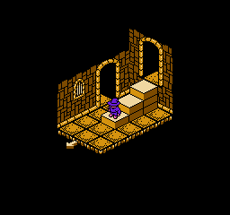
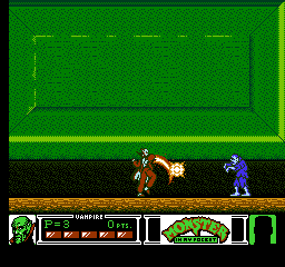
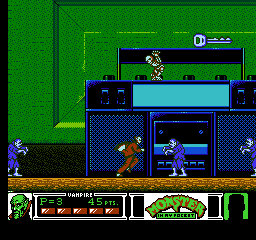
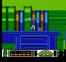
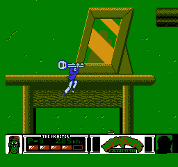
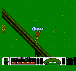
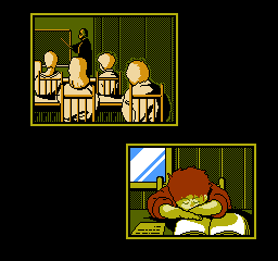
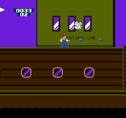
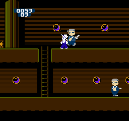
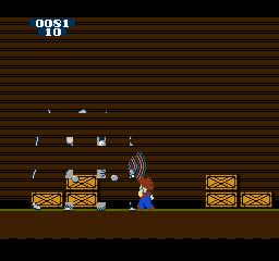
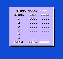
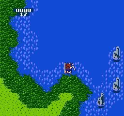
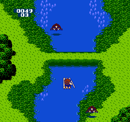
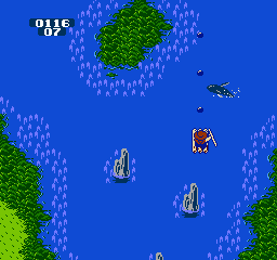
These screenshots were generated by NEStopia; if you see any oddities at the top and/or bottom, that's because NEStopia's screenshots ignore overscan clip settings, thus showing the top and bottom 8 pixels that are normally hidden on an NTSC television (and in most emulators).
From FirebrandX's "Magnum (FBX) - Palette Info" text file:
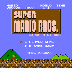
“Nintendo Entertainment System NTSC Composite Palette Project: "Magnum (FBX)" My final work on NES palettes. This palette expands on the work done with the "Smooth" palette, only with much more refined technique and extra saturation (balanced via the chroma dial on a PVM using an unmodded front-loader NES console's composite video output). Here's a break down of how the palette was designed: - PVM's have both RGB and composite video input, and on the front of them, there are buttons for quickly toggling between the two feeds live. Previously on the "Smooth" palette, I borrowed someone's Analogue Nt Mini and quickly dialed in the relative brightness, saturation, and hue of each color using a custom ROM that filled the screen with a single color entry. A few tweaks had to be made due to the composite feed sending a much strong volt level to the blue phosphors in a few of the brighter blue entries. The same had to be done with "Magnum", and I made sure to retain the hue at a small loss of brightness for those entries. So when you play Super Mario Bros., it will still have the blue sky you remembered seeing as a kid (or currently if you use a NES or NES clone with composite video output).
- This time around on the "Magnum" palette, I now own an Nt Mini Noir, which allowed me to obsess as long as I needed to without a deadline to worry about. So instead of judging colors based on fullscreen feed-swapping, I used a 10X zoom magnifying glass and actually inspected the sub-pixel phosphors. As it turns out, you can gauge the hue, saturation, and brightness by the shape, size, and intensity of each of the red, green, and blue phosphor elements. This was a HUGE breakthrough in color accuracy on all levels. No longer did I have to judge the entire screen switching back and forth between fullscreen feeds, as now I could compare individual phosphor elements and immediately spot size and intensity differences. So much so in fact, I was able to dial in perfect hue, saturation, and brightness just by inspecting one set of RGB phosphors. When I took away the magnifying glass to sit back and view the entire screen while toggling between feeds, the colors were a spot-on match! The downside is this was VERY tedious and exhausting work comparing individual phosphors, but I wouldn't accept anything less than that level of accuracy.
- 4K resolution photographs were taken of the phosphors as a backup method to cross-verify my own visual inspection with the magnifying glass. The photographs were not very helpful for determining hue directly, but strongly suggested what it should be by the comparison of the phosphor shape. Again, this served as a backup method, but visual inspection with the 10x magnifying glass proved to be much easier to formulate which channels of the RGB needed to be adjusted. For example, as you lower the intensity of a color channel, the phosphor doesn't just get dimmer, it actually shrinks in size and shape! So, many times when I inspected the phosphors on the next color entry, I would see red for example being much more elongated in my palette versus the unmodded composite feed. I then would turn the red value down until the red phosphors shrank to the same size as the composite feed versions. This worked like a champ, with the exception of the few blue entries that cannot be matched in RGB 700mV color space. When you zoom in on the phosphors for the blue Super Mario Bros' sky, you can actually see the blue phosphors are physically larger and brighter than 255 RGB can output. This explains why you can't reach that 'neon blue' glow from composite video for that sky color. 700mV simply isn't enough power to excite that blue phosphor to the same level as the composite video feed does.
To wrap up, I want to say a few things about this palette and others: "Magnum" looks absolutely STUNNING on a PVM, BVM, or RGB-capable CRT. You'll want to play NES games all day just marveling out how good the games look. Now I did do some comparison analysis with another popular palette called "Wavebeam". While that palette looks visually impressive, it does not take into account relative brightness for each row of NES colors (of which there are 4 rows). As a result of this, I found several examples of certain colors 'popping' in brightness more than they are supposed to, and thus, is not accurate to NES composite video behavior. So I look at it as this way: "Wavebeam" is an eye candy palette that is certainly enjoyable if you're not too concerned with relative brightness accuracy. "Magnum" is an eye candy palette that stays faithful to the NES behavior, albeit with saturation dialed up for a more impressive look in RGB feeds on CRTs. So in conclusion, the only three palettes I would recommend using are "Magnum" most especially for CRTs (and also looks great on digital displays), "Wavebeam" mostly for digital displays and if you want a little more 'pizazz' at the cost of accuracy, and lastly "PC-10" for histroical accuracy of the NES Playchoice 10 arcade PPU colors. All of my other palette work is now moved to my deprecated folder contained in the zip file for these palettes. Concerning the Analogue Nt Mini Noir: You MUST set the analogue RGB output feed to 700mV for palette accuracy. Refer to the user manual to find this setting. Cheers and enjoy for the start of the new year! -FirebrandX January 1st, 2021”
|